Evolving the Trusted mobile app
Role
Lead Product Designer
Team
Gisele - Jr PD
Melvin - EM
Emily - Jr Mobile Dev
Ross - Mobile Dev
Brian - Senior Mobile Dev
Rahul - Senior Mobile Dev
Timeline
6 months
TL;DR
I led an initiative to improve Trusted’s mobile experience increasing usage from 65% to 90%.
Challenge
Unlock mobile app experience for all users types and establish a visual language that can be used to create a design system.
Momentum from improving the app for working clinicians
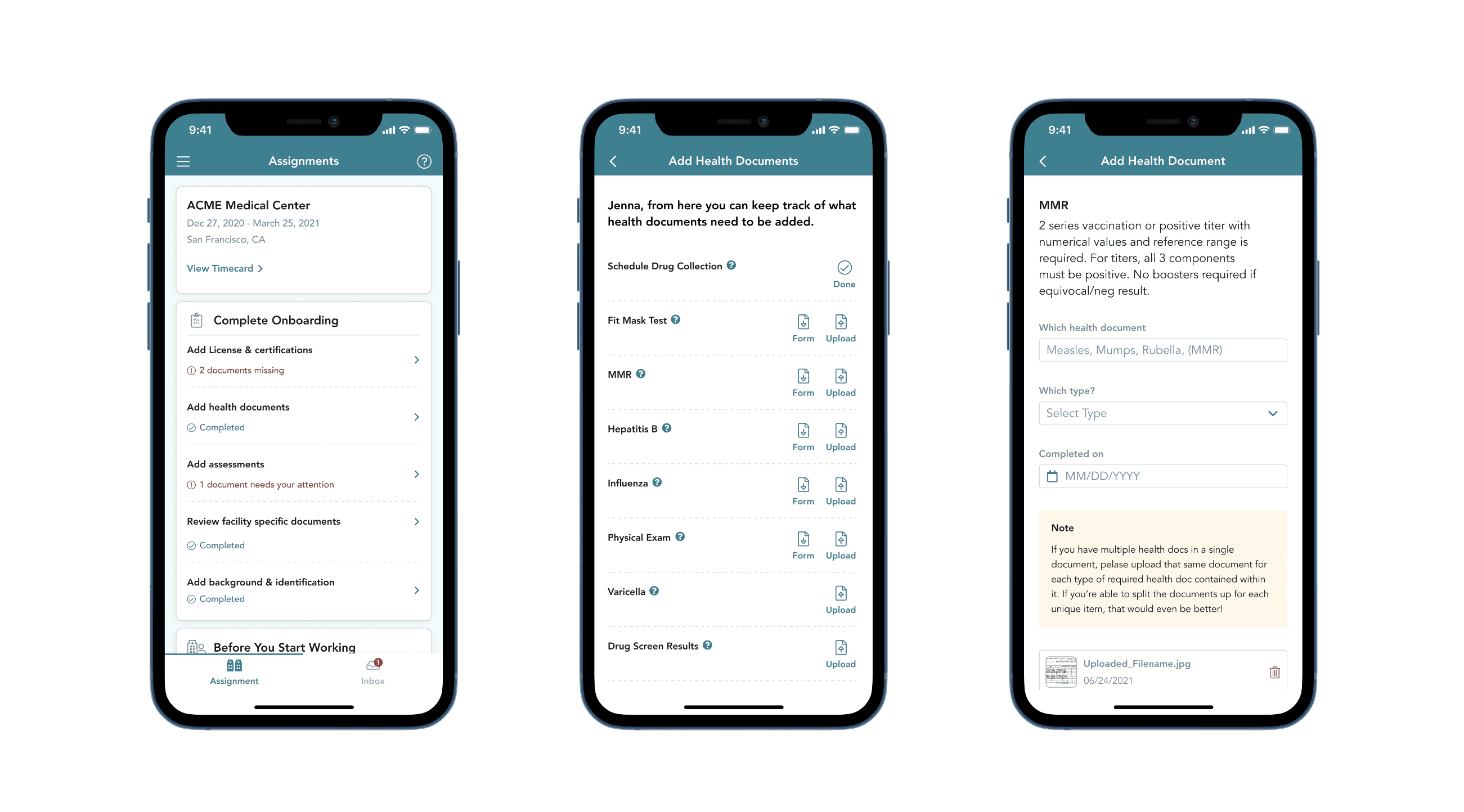
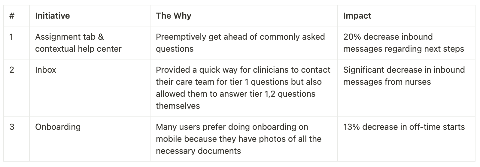
After successfully getting Works V1.0 off the ground, I was assigned to another team that would improve and evolve the Trusted Health mobile app, which at the time was only for working nurses to submit their weekly timesheets. Eventually, the team’s scope and responsibility grew from just focusing working clinicians to overseeing the entire marketplace experience, which was from sign up all the way to application submission. In our first quarter as a team, we successfully launched two key mobile app initiatives that brought to light that we should continue to evolve our mobile app:
65% of clinicians perform key tasks on their mobile devices
I discovered that about 65% of our users preferred to perform key marketplace web tasks on their mobile devices which, at the time, were not optimized for mobile.
The other key reason we wanted to invest more in mobile was that it could potentially be more of a sticky experience than its web counterpart by leveraging native functionalities such as push and in-app notifications to nudge users to perform key tasks or to apply to jobs that match their preferences as quickly as possible.
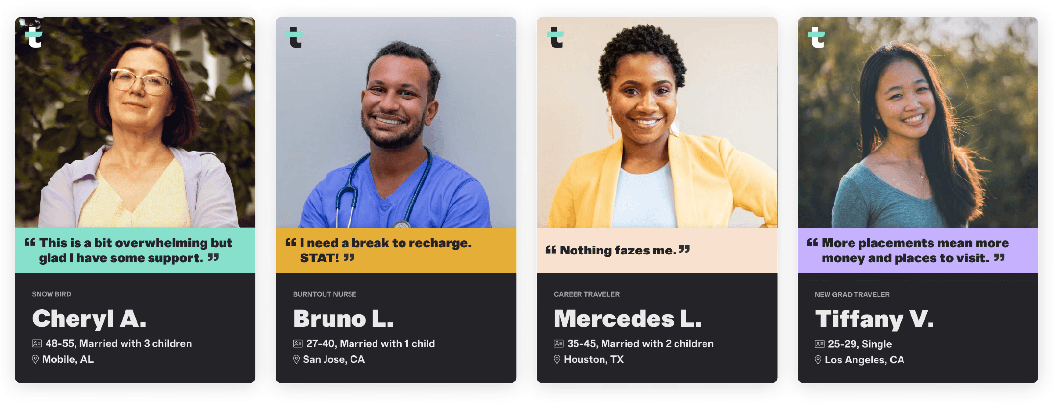
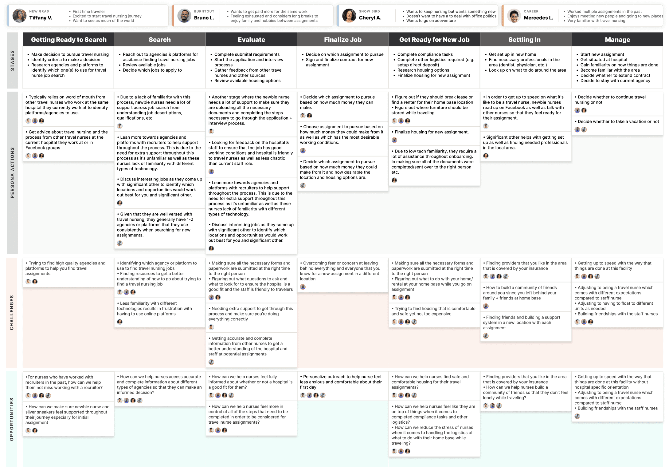
Two week research sprint to develop empathy for clinicians and our customer experience team (CX)
When I moved to the marketplace pod, I didn't have time to conduct any user research because I immediately started working on the Assignment tab and Inbox features in the app. At the beginning of this project, I advocated for setting aside two weeks to talk to clinicians and member of our CX team to fill in knowledge gaps on how the Trusted marketplace platform currently operates and how enablement teams support a clinician from sign-up to receiving an offer.
Key insights
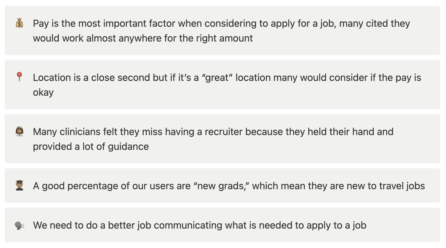
We could have easily just translated what was on web but all of us knew there were opportunities to make improvements because no user research had ever been performed. Ultimately, the research sprint allowed us to hone in on themes brought up by clinicians and members of our CX team.
What should we bring over to the mobile app?
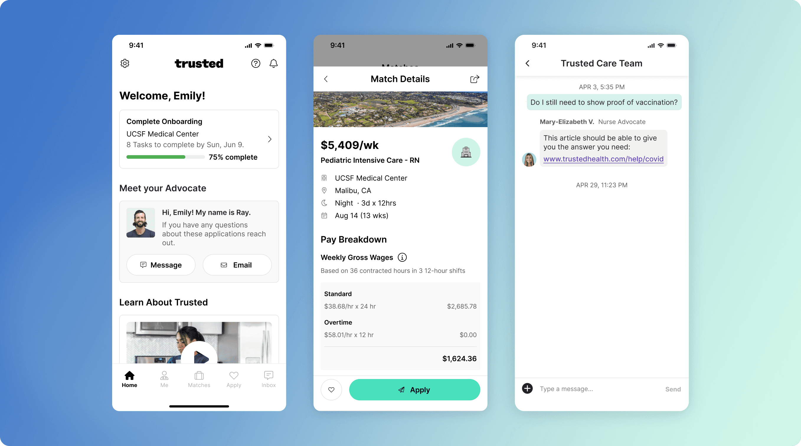
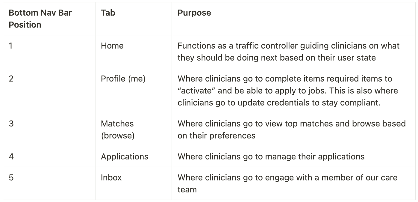
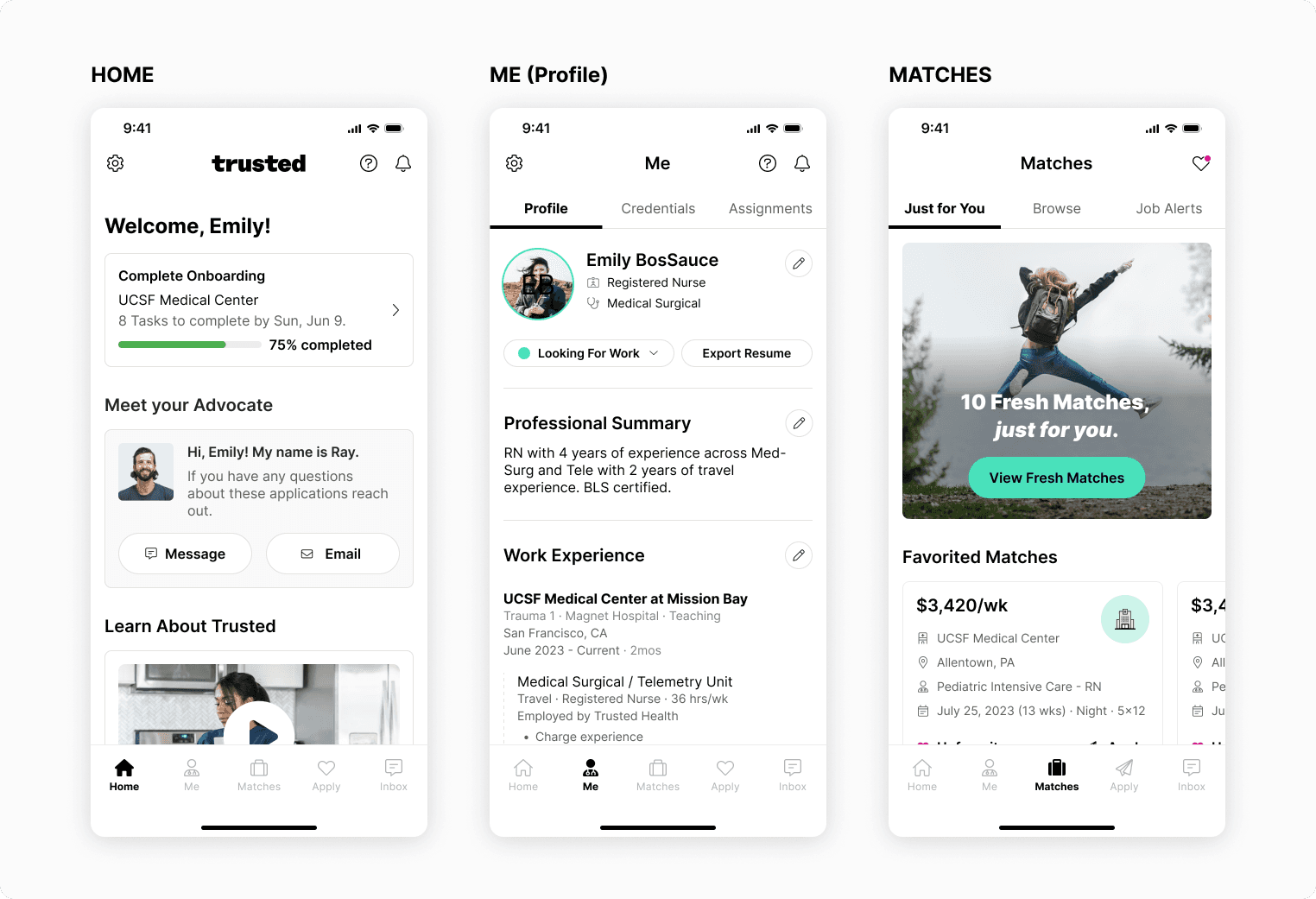
To help narrow our focus I conducted a red route analysis to identify the most essential user tasks that we should focus on. After doing the exercise, we were able align on the following tab structure for the mobile app.
Creating a vision to start conversions and rally behind
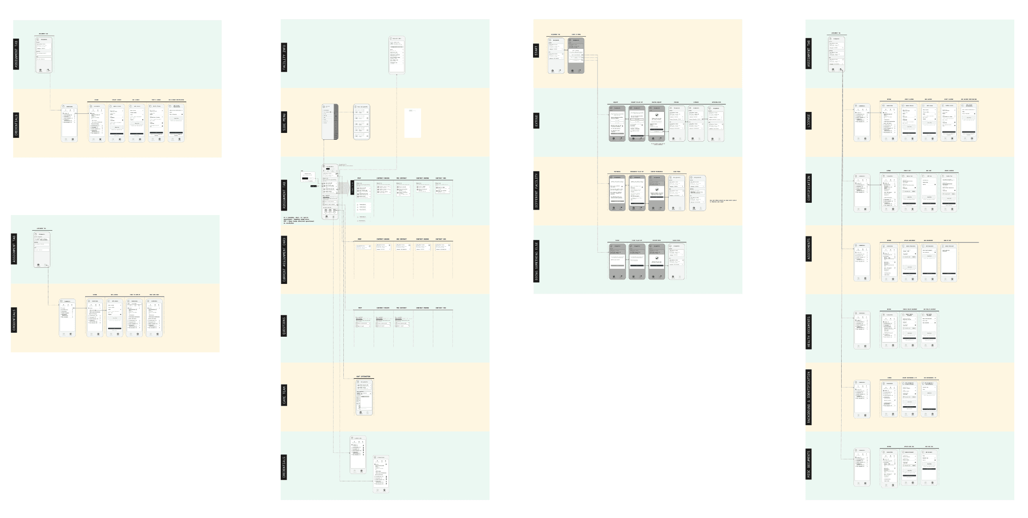
I developed a set of low-fidelity wireframes and prototypes, as well as a high-level user flow of the Marketplace. This was to foster understanding and ensure alignment on the sequence and timeframe for each project.

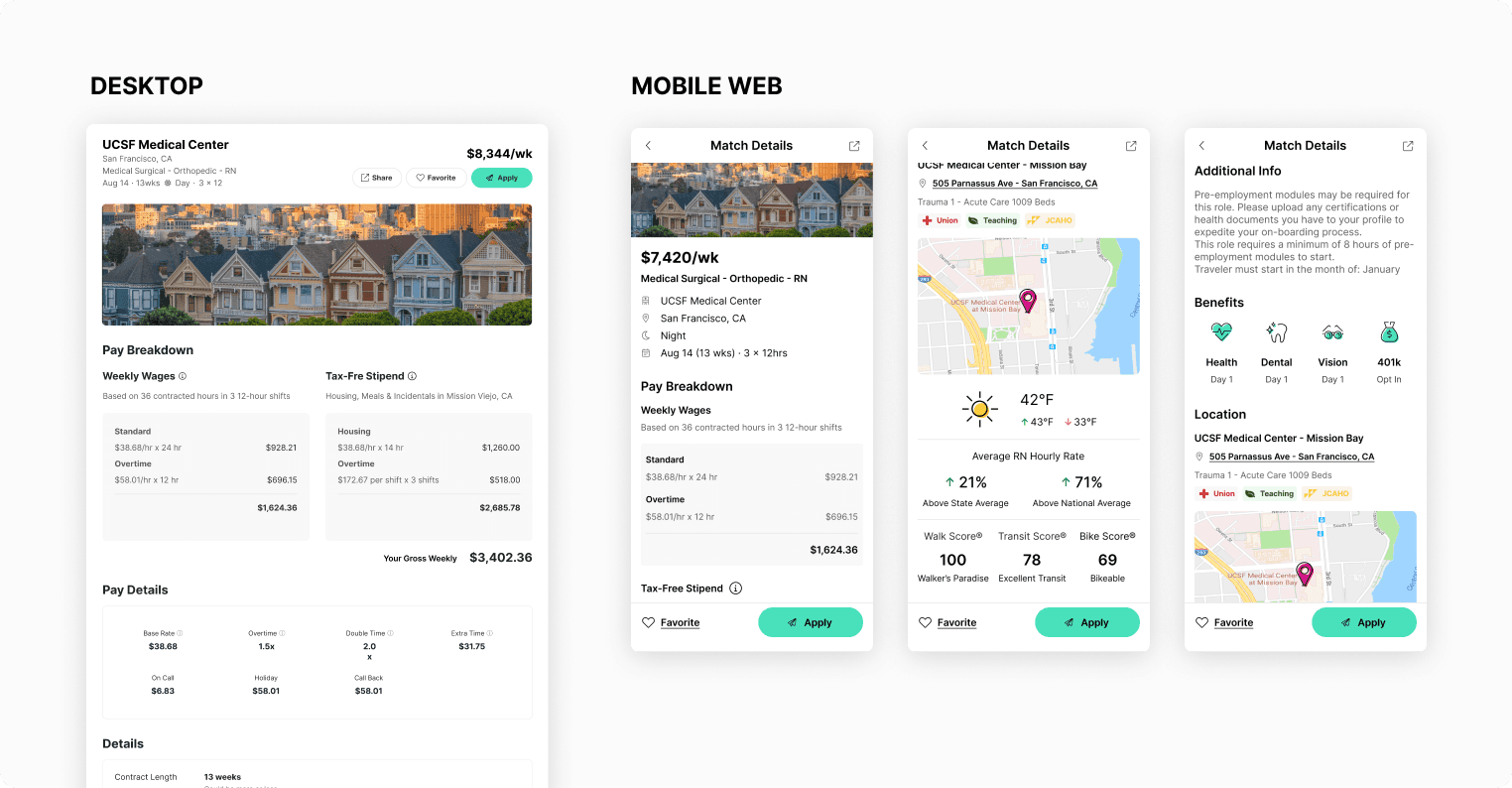
Mobile app <> web experience
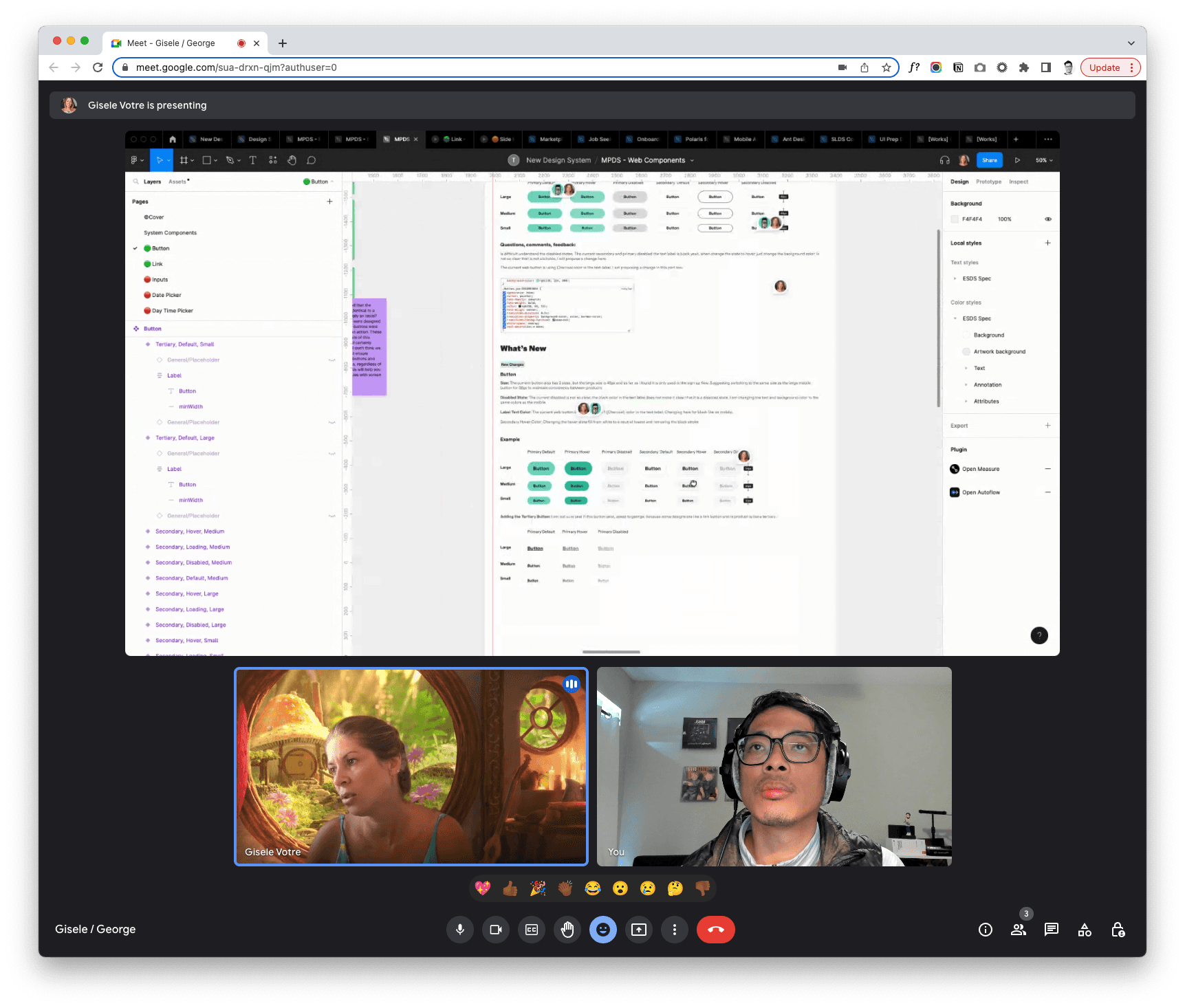
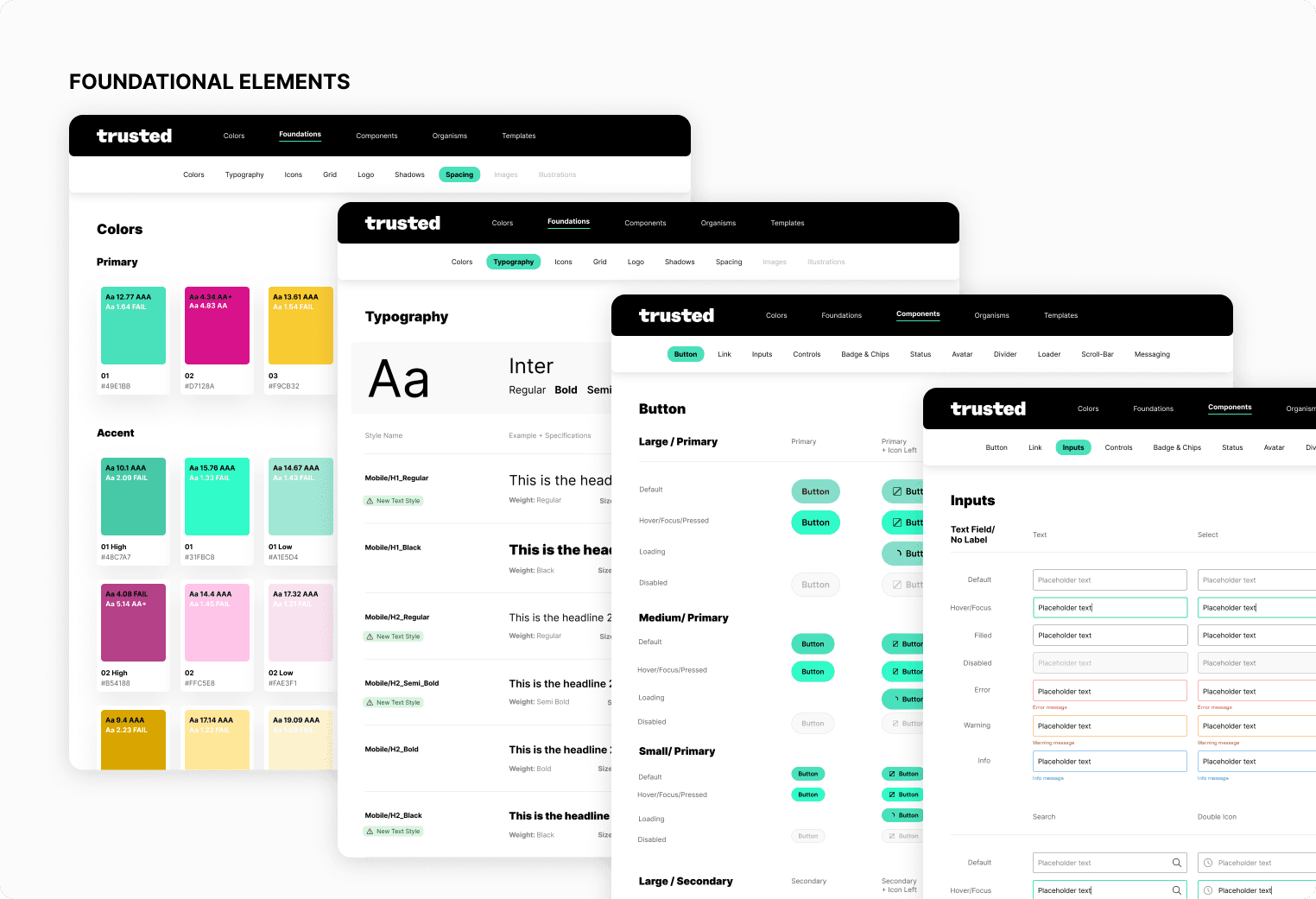
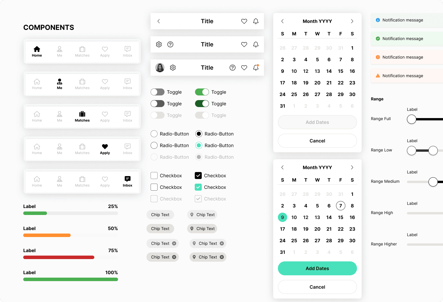
Before I started designing any of the new screens, the two other product designers and I held a working session to come up with an interpretation of how to use our new brand colors. Once we got alignment from all key stakeholders on our interpretation, Gisele and I went to work on creating foundational styles—colors, typography, buttons, and form fields that we could later use for our web platform. I pushed for Gisele to be the design system point-person since she was the strongest visual designer and had a strong curiosity in learning all things design systems.
Gisele helped with coming up with illustration styles and generating usable components for our mobile design system. Additionally, Gisele helped explore different design directions and proposed strategies on how we could organize and manage our design system.
Impact
Each release of this project contributed to the improvement of different areas of our funnel. The decrease in inbound messages allowed our CX team to devote more time and energy to helping clinicians secure their next opportunity. Additionally, the native browsing and application experience enhanced the submission-to-offer process, enabling clinicians to make decisions and be submitted to job opportunities more quickly.

